

NHL logo rankings No. 23: Winnipeg Jets
The Winnipeg Jets logo has a few fans in the THN office thanks to its historical ties, but tumbles in the ranks because of its simplicity. Hey, at least it's not the Thrasher design.
The No. 23 spot in the THN logo rankings belongs to the Winnipeg Jets. Popular team with its fans, not so popular among anyone predicting the 2014-15 Central Division standings, and not so popular in the logo department. That said, as we creep up toward the middle of the logo ladder, each ranking becomes more contentious and closer to split down the middle. Winnipeg's critics outweigh its supporters, but the anti-Jet sentiment isn't unanimous. We can at at least say team's design depicts what it's supposed to depict, unlike jumbled messes such as, say,
Colorado's. There's no debating that a fighter jet adorns Winnipeg's sweaters. Another plus: the logo is inspired by the
Royal Canadian Air Force. Simple, understated design and a historical connection? That should be a recipe for a high rank, but "simple" is the operative word. It's too basic. The plane is just dropped on top of the
existing Air Force logo. Most of the THN staffers laughed this logo out of the room, comparing it to Microsoft Word's Clip Art. Remember Clip Art images? Those stock photos and cartoony symbols you printed off your computer to take up space on your science fair Bristol boards? The Jets logo has that feel to it. The plane itself has very little detail and the Maple Leaf feels like a lazy attempt to placate fans of a Canadian team. The logo looks more like a glorified shoulder patch in the eyes of its haters. Do you agree the Jets logo was slapped together too quickly? Try your hand at a new design, preferably without using Clip Art. Draft up a hot new look and send it to editorial@thehockeynews.com. At the conclusion of our logo rankings, we'll share our favorite redesign submissions from readers. Don't stop with the Jets, either. You can try your hand at all
30 NHL logos if you want. (All logos below are from
Chris Creamer's website.)
HISTORY OF THE JETS LOGO Don't confuse the Jets with the, er, Jets. The original Winnipeg Jets belong to Arizona Coyotes canon. The modern Jets extend from the ugly, pitiful roots of the Atlanta Thrashers franchise. What on Earth is a Thrasher? Even though the franchise's horrific uniforms had an unmistakably "Xtreme" feel to them, the Thrasher name didn't come out of nowhere. The brown thrasher is actually Georgia's state bird, and fans voted in the team name. Second place, the Flames, would've been awkward for Atlanta and Calgary. Those voters had evidently never heard of the embarrassing Rough Riders/Roughriders debacle in the CFL. The brown thrasher isn't an intimidating bird, but it's
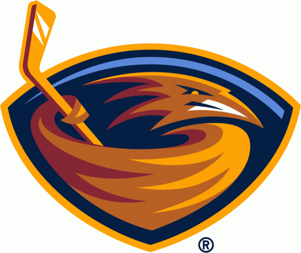
elegant enough and could've made for a decent logo. Alas, this team was founded in the late 1990s, at the peak of ugly new-age jerseys. The result was this:
Sigh. It looks like someone stuck a bird's head in a bowl of butterscotch pudding and stirred it with a hockey stick.
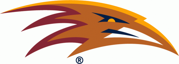
Amazingly, Atlanta never dropped the pudding bird as its primary logo. It did experiment with a few alternate incarnations, which adorned their
increasingly pathetic jersey designs. Here's one alternate crest. It's a bird! It's a plane! No one knows. Technically, it's an overhead view of a thrasher, but it's far closer t
o
No Heart from
Care Bears.
Atlanta's best attempt was to remove the bird's head from the pudding, which it did for this alternate logo:
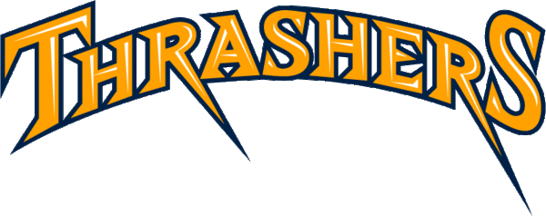
Lastly, the Thrashers seemed to give up, simply slapping the team name on its alternate sweaters in 2008-09. The lack of effort was fitting for a franchise that never won a playoff game. Maybe the design was expressing Atlanta's disgust over the Marian Hossa trade. Or foreshadowing the Ilya Kovalchuk trade. Everything about it screams "We give up. Can you move the team now?" Behold:
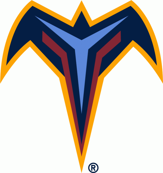
By 2011, the Thrashers had mercifully become the Jets after Truth North Sports & Entertainment purchased the franchise. Team chair Mark Chipman said the franchise wanted to honor
17 Wing Winnipeg, which is Canada's hub for all Royal Canadian Air Force personnel and the place to be if you're becoming a military pilot. The notch in the white portion appropriately and deliberately points north. The idea behind the logo is noble. It just feels like a rush job, which is understandable considering the team was purchased from Atlanta in late May 2011 and playing NHL games in Winnipeg less than five months later.
Dissenting opinion: "This logo doesn't get nearly enough respect. It's understated, but it's extremely classy. A simplistic design is better than a cluttered one, and the ties to Winnipeg's military roots create a classic, historical feel, which is rare for a new logo. If I had my way, this logo would jump 10 spots in the ranks." –
Matt Larkin Now it's your turn to design a better Jets logo. Think you can do it? Choose any color scheme you want, cook up your masterpiece and send it to editorial@thehockeynews.com. Watch for the end of our ranking release, when we'll post our favorite designs from all 30 teams. Which Jets/Thrashers logo do you like most?

surveys & polls
Matt Larkin is an associate editor at The Hockey News and a regular contributor to the thn.com Post-To-Post blog. For more great profiles, news and views from the world of hockey, subscribe to The Hockey News magazine. Follow Matt Larkin on Twitter at @THNMattLarkin