
IceCaps unveil beautiful tribute jersey, honor 100th anniversary of World War One battle
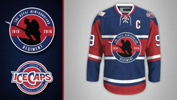
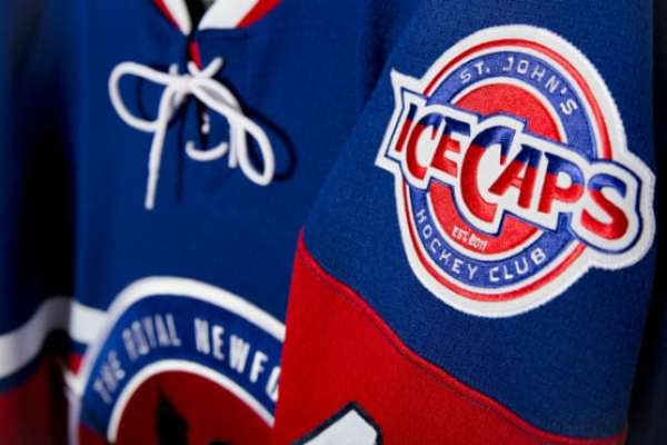
The St. John’s IceCaps unveiled a tribute jersey that pays honors the 100th anniversary of the Battle of the Somme at Beaumont-Hamel. The jersey features a silhouetted primary logo of a First World War Royal Newfoundland Regiment soldier and a brand new shoulder patch.
 IceCaps unveil beautiful tribute jersey, honor 100th anniversary of World War One battle
On July 1, 1916, approximately 733 men from Newfoundland and Labrador were killed or injured during the Battle of the Somme at Beaumont-Hamel. In the 100th anniversary year of that battle, the St. John’s IceCaps want to commemorate and pay tribute to those who fought in the battle and are doing so with a tribute jersey. The new uniform, which was unveiled Thursday in St. John’s, is a striking jersey that honors the Royal Newfoundland Regiment and the province of Newfoundland and Labrador. Using the color scheme of the parent club Montreal Canadiens, the jersey uses both broad and narrow striping, a two-color collar and the wide horizontal band of color across the torso that has been used for years on Canadiens jerseys. Take a look:
“The bravery exhibited by the Royal Newfoundland Regiment was one of the most tragic moments in Newfoundland and Labrador’s history; and was also a defining moment as we essentially lost an entire generation of young men,”
IceCaps president and CEO Danny Williams said Thursday. “In a world still ravaged by war and loss, it is our hope that this tribute jersey helps us not only to remember, but to also convey the pride and admiration we have for those who have and continue to make the ultimate sacrifice.” The logo itself is outstanding and the silhouette of the First World War Royal Newfoundland Regiment soldier pops. It’s rare for teams to use any logo that doesn’t feature the team’s word mark front and center, but the IceCaps’ new sweater doesn’t bear the club’s name and instead has ‘The Royal Newfoundland Regiment’ bordering the silhouette. “I wanted to represent a Royal Newfoundland Regiment solider,”
said logo and jersey designer Troy Birmingham. “I wanted it to be a simple, stark image that grabbed your attention. I chose a silhouette because it could be anyone’s father, grand-father, brother, son, etc.” Birmingham added that one touch he especially likes is having the silhouette’s bayonet extend beyond the roundel. He added that the blue jersey completes the set for the IceCaps, as they already sport red and white jerseys on a regular basis.
For shoulder patches, the IceCaps are utilizing the Newfoundland and Labrador flag on the right and a brand new mark on the left. The new word mark patch for the left shoulder eliminates the icecap that is usually in the backdrop of the logo, as well as placing the word mark across a roundel and extending out each side. In a way, it mirrors the tribute jersey’s primary logo. The IceCaps will debut the jerseys on ice during a set of games Feb. 5 and 6 against the Utica Comets at St. John’s Mile One Centre.