
Do you care more about history or artistic creativity? That dilemma put Montreal's classy-yet-simple crest in the middle of the pack at No. 13 in our logo rankings.
Another Original Six team falls in the THN logo rankings. This time, it's
the Original Six team, the New York Yankees of hockey, the most storied, most successful franchise in the history of the sport. And that's why plenty of rabid fans have probably oiled and ignited their torches already.
The Habs? Not even in the top 10? Subscription cancelled, bro. It was a surprise even to our voting panel when the Montreal Canadiens logo finished a modest 13th. The question to ask, however, isn't "How could you?" It's "What's truly great about the logo?" We know it calls to mind nostalgic images like Rocket Richard bearing down on goaltenders furiously or Guy Lafleur's perfect hockey hair flapping in the breeze. Bleu, blanc et rouge is a pleasing color scheme. But strip away for a moment all the championships, all the history, and what do you have? Well, there's a 'C,' and there's an 'H.' And they're fused together. It's a perfectly old-school, understated, classy crest, and that's why we liked it enough to rank it in the top half of the league. But, ironically, the rich history that had many of us doodling this logo when we were kids is also what drags it down. An eight-year-old can indeed replicate it rather easily with a few pencil crayons.
Care to announce yourself as a hockey heretic and reimagine the sport's most storied logo? We dare you. Give it your best shot and submit your design to [email protected]. If we like yours enough, we'll publish it among our favorites at the end of the process. Go ahead and try one for
all 30 NHL teams if you're feeling creative. (All logos below are from
Chris Creamer’s website.)
HISTORY OF THE CANADIENS LOGO Believe it or not, Montreal's first logo was even simpler. There was no 'H' to speak of yet, just a 'C' to symbolize Club Athletique Canadien. It's pretty plain by today's standards, but every logo in 1909 was.
In 1910-11, the logo became more artistic, complete with an old English 'C.' It's shown as blue here, but when used for throwback jerseys in 2008-09,
the logo appeared as green, and it's generally acknowledged as such.
It's interesting how similar the Habs logo was to its unborn rival Toronto team in the early days. This red, white and blue version from 1911-12 upped the letter count to three, representing the words Club, Athletique and Canadien. If this one looks familiar to you, that's because it returned on Montreal's infamous
"barber pole" throwback uniforms a few years back. The sweaters were interesting in theory, but made our eyes bleed when we tried to watch them on TV.
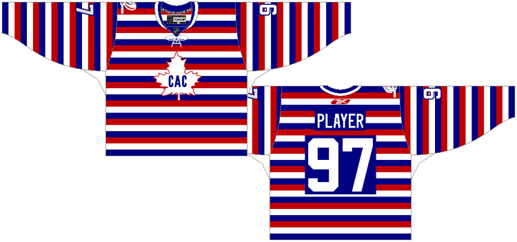
The 1912-13 logo is the first bearing much resemblance to today's. The 'C' looks awfully familiar. The 'A' combines with it to represent CAC. So the 'C' is used twice, I guess. If you find this emblem overly simplistic, ask yourself why you like the modern one so much.
Next up is the first version of the "true" Habs logo, which arrived in 1917-18. About those Habs: time to bust a myth. The 'H' in the logo does not stand for Habs or Habitants, and it never has. It stands for hockey. The crest was changed to represent the new team name: Le club de Hockey Canadien. It's a lot like today's. The design is simply cruder.
As far as primary logos go, the one used from 1919-20 to 1920-21 was the most experimental. That's not saying much. The red was darker and the 'H' was filled in. This design has a lot more symmetry to it than the logos directly preceding and following it.
The color scheme switched to predominantly white here. Neat idea, but the design sure is rough around the edges. I'd blame technology at the time, but how do you explain the previous logo, then?
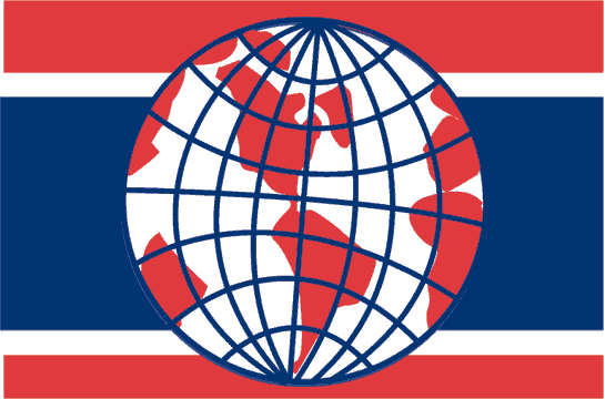
Montreal also experimented with an awesome alternate
world domination logo to celebrate its championship the season prior. Delightfully cocky. Then came the transition to the modern Habs logo. This one, which arrived for 1925-26, is hardly discernible from today's. The changes are minor from here on out. Legends like Aurel Joliat and Howie Morenz wore this version.
The blue trim was thickened all around the logo in 1935-36, creating a tighter, sharper look. This crest lasted more than a decade. Maurice Richard scored 50 goals in 50 games wearing this logo.
The logo changed again from 1947-48 to 1955-56, just before the dynasty heyday, which brought Jean Beliveau, Jacques Plante, Doug Harvey and Bernie Geoffrion godlike status. It's almost impossible to tell the difference between this crest and the last. After a lot of staring I see this version is slightly squished, with a shorter ridge at the tip of the 'C.'
Last came the logo every Hab has worn since 1956-57, from the late 1950s dynasty to Lafleur and the late 1970s dynasty, to Patrick Roy, to P.K. Subban. The key change is a closed 'C,' with its top and bottom edges curling into each other in a symmetrical shape. There's no denying the sense of history that washes over you when you stare at this one, but it doesn't have the creativity or master craftsmanship of the top logos on our list.
Dissenting opinion: "It's an iconic logo that has aged very, very well. It should be No. 1, in my opinion." –
Ken Campbell Can you come up with a new take on a classic image? Send your Canadiens redesign to [email protected] and watch for yours when we publish our favorites.


panel management
Matt Larkin is an associate editor at The Hockey News and a regular contributor to the thn.com Post-To-Post blog. For more great profiles, news and views from the world of hockey, subscribe to The Hockey News magazine. Follow Matt Larkin on Twitter at @THNMattLarkin