
St. Louis Blues' New Logo And Uniforms Were A Long Time Coming


The St. Louis Blues are dipping into their past for their future.
The franchise has just unveiled new uniforms, inspired by their original look and also informed by what fans liked about past Winter Classic jerseys worn by the team. That feedback was important.
"It was absolutely vital," said Blues executive VP, chief revenue and marketing officer Steve Chapman. "It started in 2017 with the Winter Classic and just the feedback we received from not only fans but alumni as well. That's when it really started percolating. With any franchise, you're a little hesitant to make changes, but particularly with the Blues: we're steeped in tradition, and the Note is such an iconic element of what we do."
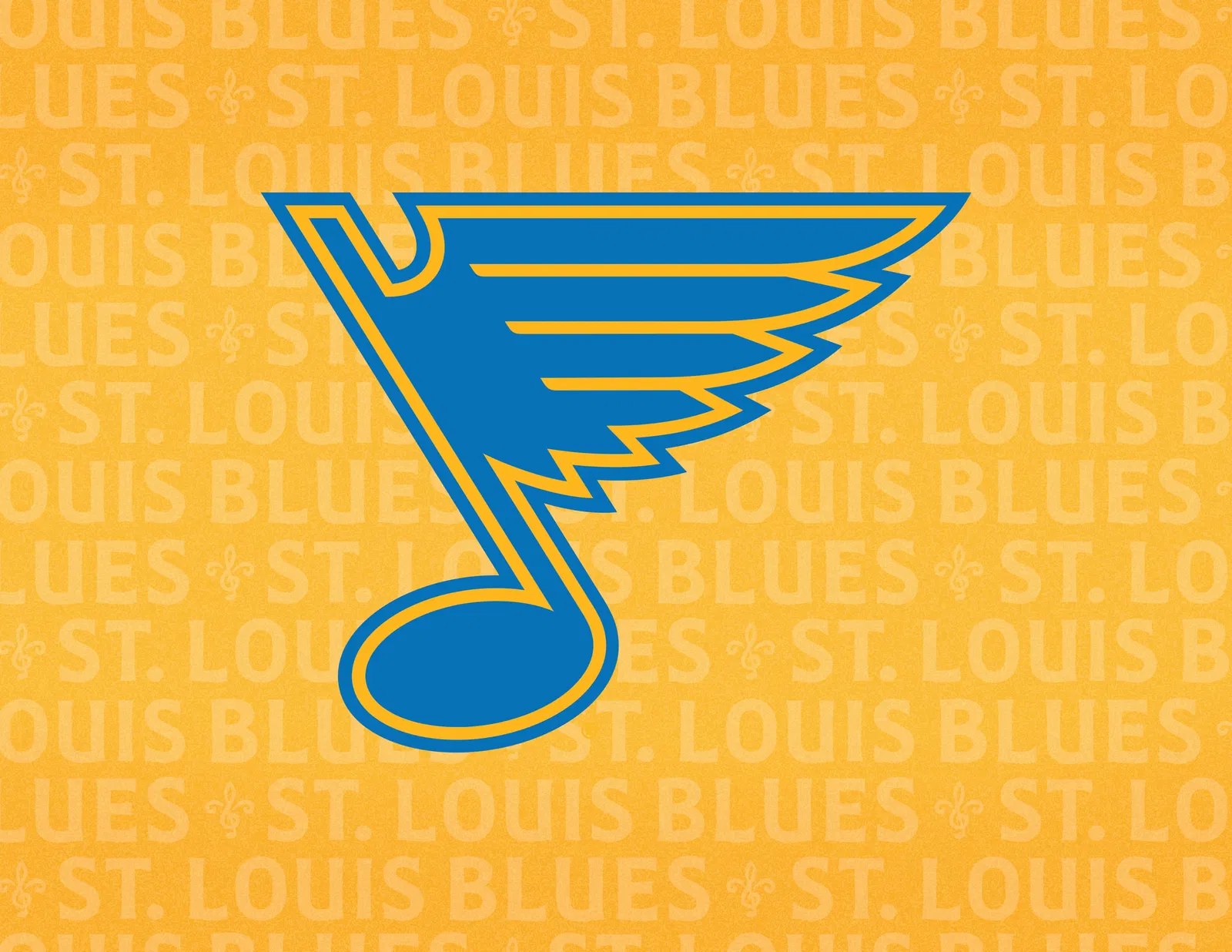
 The new Blue Note has thicker keylines while returning to the team's original blue and yellow colors. (Courtesy of St. Louis Blues)
The most important takeaway from the reveal is that St. Louis is going back to its original color scheme, with royal blue now getting shifted to the third jersey. Personally, I've always preferred the original blue, so I'm on board with this change.
But what I really like is the addition of an interlocking 'STL' logo on the pant leg. This new mark (there are two others – one a fleur-de-lis and the other a trumpet featuring the famed Gateway Arch) looks great on a hat, but also ties the Blues together with a couple of other local sports programs: baseball's St. Louis Cardinals have one of the most famed emblems in the game, while the Saint Louis University Billikens have also used an interlocking 'STL' in the past (trust me, I had the hat back in the day). The Blues now enter the game with their version, one that brings to mind a treble clef – just one of the nods to the city's connection with music.
"That has been a project probably 10 years in the making," Chapman said. "Our intention was to create a secondary mark that said 'St. Louis' and obviously the 'STL,' anyone who sees that, they know what it means. The challenge was that the Cardinals' 'STL' is such an iconic look, and it seemed like everything we did either looked a little too much like that or, in some cases, was just boring."
 The Blues' new tertiary marks (Courtesy of St. Louis Blues)
Enter the design firm RARE, which worked with the Blues' team and brought an interesting perspective to things.
"RARE is based in a little town outside Hattiesburg, Miss.," Chapman said. "They were not versed at all in hockey, but what they were versed in was Mississippi Delta blues, which is what our name and logo is an homage to. That's where you get the treble clef, and we think it looks outstanding and unique."
As for the main crest itself, the iconic 'Note' has been given an update, but nothing drastic. Really, St. Louis is one of those hockey teams that can never stray too far in this respect, and why would they want to? The new Note is only blue and yellow – the current one also has beige – and has been slightly re-shaped. It will also have thicker lines.
"The Note is iconic and is such a rich part of who we are," Chapman said. "It's a remix of our mark and an homage to the original Note. I give a lot of credit to our design team. We want to respect our past but look forward to our future in doing so."
All in all, this is a nice update from the Blues, and it is cool to know they based some of it on how their fans reacted to some previous special uniforms.
Get the latest news and trending stories by following The Hockey News on Google News and by subscribing to The Hockey News newsletter here. And share your thoughts by commenting below the article on THN.com.