
Utah Mammoth Is Here: Instant Review Of New Name, Logos And Jerseys

 The Utah Mammoth revealed their new logos and jerseys on May 7. (Courtesy of Utah Mammoth)
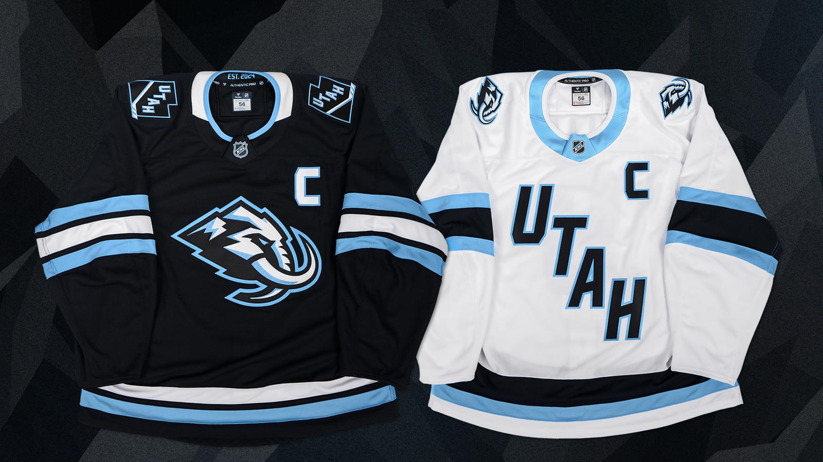
The Utah Mammoth have arrived.
The NHL's newest branding dropped today, with Utah getting its official name after playing its first season in Salt Lake City.
The color scheme of 'rock' black and 'mountain' blue remains, but now, the team can play with a mascot on the front of their jerseys.
It's a pretty solid logo that won out in the end. 'Mammoth' is a cool name, and the mountain aspect of the mascot's crown obviously reflects Utah's famous geography - specifically the Wasatch mountain range.
For the white version of the sweater, Utah is sticking with the stairstep lettering they used in Season 1 but with an updated font to make it a little more unique.
The name for me is a winner.
I always found 'Utah HC' too soccer for my liking, and as a writer, it would have been a nightmare when describing players in text ("The HC right winger is on a three-game point streak" just doesn't sound right, and you can't use 'Utah' every single reference in an article).
'Mammoth' sounds powerful, and no other major hockey team or Big Four sports franchise has the name in North America – something that is getting harder to accomplish as time goes on. (Yes, we're aware of the Colorado Mammoth in lacrosse.)
 (Courtesy of Utah Mammoth)
The details of the sweaters is where things get fun, of course.
As graphic design gets more sophisticated, artists have been able to add lots of subtle surprises (I'm trying not to use the term "easter eggs" here, but you get what I'm saying). The mammoth's tusk forms a 'U' for Utah, for example, while the state of Utah's geographic outline can be seen by the beast's eye.
Overall, the name and the jerseys are a winner for me, and it will be fun to see the sweater in action when Utah makes its first pick at the draft this summer. Tusks up, folks.
Get the latest news and trending stories by following The Hockey News on Google News and by subscribing to The Hockey News newsletter here. And share your thoughts by commenting below the article on THN.com.